Formation Type Foundry
Embracing the fascination with type and typography since my early days in Graphic Design, I've nurtured a keen eye for the intricate world of fonts. My journey into digital typefaces commenced in 1995 when I crafted my first as part of my final Degree project—an endeavor that became even more gratifying when utilized for a client during my inaugural job with BT.
As a seasoned professional in design, I've traversed a vast landscape of fonts over the years. Yet, there's a unique satisfaction in "growing your own."
In 2012, Formation Type Foundry emerged from my desire to venture into the creation of fresh and innovative typefaces. My design inspiration often stems from the organic shapes found in nature, providing a captivating starting point for my graphic and type design explorations. Now situated in Corris, nestled in the untamed beauty of the Dyfi Valley in Wales, my surroundings serve as a constant wellspring of inspiration.
The allure of type design lies in its boundless creative potential and the intrigue of its applications. I find equal excitement in witnessing how fellow designers interpret and utilize my fonts as I do in the process of crafting them. Together, let's propel the boundaries of possibility in the realm of type design.
Custom Type Design
Crafting a distinct visual identity is paramount in the world of branding, and a custom-designed font serves as a powerful asset in articulating the unique character of your business or product through every word.
From a few letters incorporated into a logo to a fully functional typeface boasting a comprehensive pan-European character set, multiple weights, styles, or custom glyphs, custom type design is a versatile realm. I can seamlessly translate a unique design from a rough sketch to precise digital artwork, culminating in meticulously spaced and kerned final font files, available in the latest formats, webfonts, or OpenType.
Subject to copyright agreements, I am also adept at utilizing cutting-edge font generation software to customize or expand existing font families based on your specific needs.
Given that type design is a specialized and labor-intensive field, feel free to reach out and discuss your thoughts or requirements. I'm here to help align your vision with your budget.
Mineraline
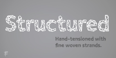
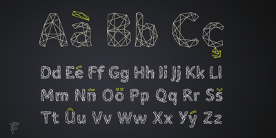
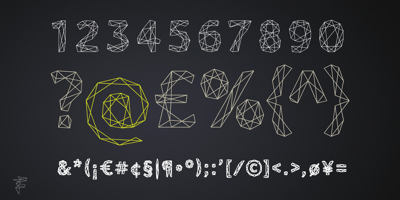
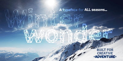
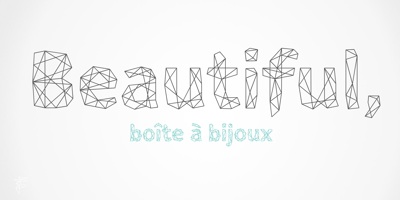
This distinctive multi-weight type family draws inspiration from the crystalline, faceted forms of minerals. Characterized by a striking geometric design, the intricate linear structure imparts a dynamic and dimensional feel to the letterforms, particularly suitable for display use in expansive sizes.
The unique linear structure enables the variation of the line-weight within the character framework, providing the family with a nuanced 'visual' weight without altering traditional stroke width. At smaller sizes, the type exhibits intricate detailing, resembling a woven texture. As the size increases, the framework and beveled joints become more pronounced and visually striking.
From the delicate Light to the robust and angular Ultra, Mineraline is designed to infuse your work with a distinctive, modern, and creative edge. Its multiple weights cater to various applications, including Branding, Logo & Identity, Retail, Point of Sale, Packaging, Advertising, Fashion, Digital and Film, or any other experimental graphic and typography endeavors.
Available Formats:
Opentype OTF
TrueType TTF
Language Support (ISO 8859-1):
Afrikaans
Albanian
Basque
Breton
Corsican
Danish
English (UK and US)
Faroese
Finnish
Galician
German
Icelandic
Indonesian
Irish (new orthography)
Italian
Latin (basic classical orthography)
Leonese
Luxembourgish (basic classical orthography)
Malay
Norwegian (Bokmål and Nynorsk)
Occitan
Portuguese
Rhaeto-Romanic
Scottish Gaelic
Spanish
Swahili
Swedish
Walloo
Also Available at Leading Online Retailers:
Myfonts
HypeForType
Pebl
Inspired by the naturally simplified and smoothed shapes of beach pebbles, Pebl is a bold, super-rounded display typeface exuding a friendly feel. Stripped down to basic, smooth outlines without counters, this font is perfect for logos, branding, headlines, or abstract type shapes across various mediums.
Available Formats:
Opentype OTF
TrueType TTF
Language Support (ISO 8859-1):
Afrikaans
Albanian
Basque
Breton
Corsican
Danish
English (UK and US)
Faroese
Finnish
Galician
German
Icelandic
Indonesian
Irish (new orthography)
Italian
Latin (basic classical orthography)
Leonese
Luxembourgish (basic classical orthography)
Malay
Norwegian (Bokmål and Nynorsk)
Occitan
Portuguese
Rhaeto-Romanic
Scottish Gaelic
Spanish
Swahili
Swedish
Walloo


